[see 3/15/18 update at the bottom of this post for the current state of the Port’s site]
The Port of Seattle has finally updated their “Flight Patterns” page sometime in the last few months: https://www.portseattle.org/projects/flight-patterns
For years it had shown the pre-NextGen flight paths. The old page showed the Southflow flight paths widely dispersed in a swath miles wide (red – arrivals and green – departures):

The new page shows the current paths (click for a high-res version):

I can vouch that this is an accurate representation of typical current Southflow flight patterns. However, notice anything….missing? Like a 37 square mile island home to over 10,000 people, many of whom settled and invested decades of their lives there specifically because it was so quiet and rural (Vashon is accessible only by ferry). It’s just left of the center of this image (shown as water), right under that razor sharp RNP path.
Bainbridge and Mercer Islands are also missing, perhaps to make the omission of Vashon appear less blatant, whereas further South much smaller McNeil Island and Anderson Island are shown, perhaps since they don’t have any overflights and thus no need to pretend they don’t exist.
This is truly chilling and calls to mind previous episodes in history where graphics are doctored in an attempt to create an alternate reality: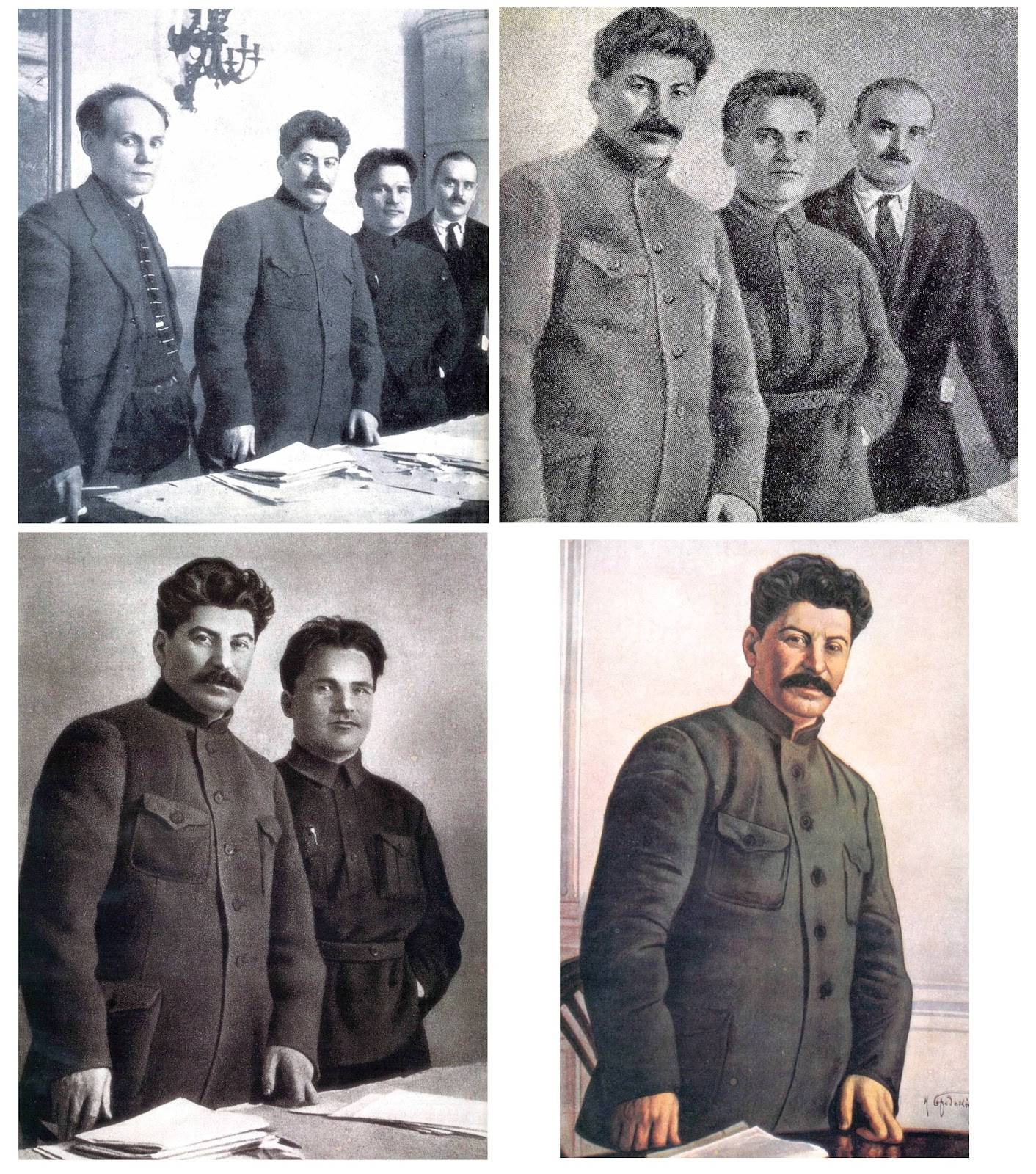
However I suspect the Port Of Seattle will have a harder time wiping trillions of tons of glacial till off the map, literally, than Stalin had dispatching his (perceived) political opponents.
Something else stands out as ominous in this new flight track graphic. Notice the collection of flights crossing over from the East to the West side and joining the HAWKZ approach? If this was due to excessive congestion on the East side it could be understandable, but the times I’ve observed this* it’s always late at night when there’s no traffic on the East side, but there is room on the West side to slip them in. It could be that the ultimate plan, if aircraft separations can be reduced (airlines & the FAA are pushing this), is to have ALL Southflow arrivals from South of Seattle go up the West side, eliminating overflights of the Bellevue area but nearly doubling the noise over Vashon already increased many fold due to NextGen. At that point it will truly be as if the airport just moved in next door. A constant thunder of overhead low flying jets, one bleeding into the next, that will completely replace the sound of birds singing and wind rustling through branches of trees we had until mid-2015. Rural Vashon Island would become the dumping ground for the entire region’s noise pollution.
The old “Flight Patterns” page is archived here: https://web.archive.org/web/20160304154908/http://www.portseattle.org/Environmental/Noise/Noise-Abatement/Pages/Flight-Patterns.aspx
* I’ve not yet done a rigorous analysis of these East side to West side transfers; it’s only based on my personal observations. I’ll update this post when I’ve created a list of them.
UPDATE (15 March 2018):
Sometime in the past few days the low-res images on the Port’s “Flight Patterns” page were updated to show Vashon Island. However the hi-res images still don’t show Vashon and the new low-res images are for a different, less representative, and unstated date. For example they don’t reflect the actual East to West crossovers on a typical Southflow day. However they do show a larger area of Puget Sound displaying some of the delay maneuvers deployed by arriving aircraft, which represent pure wasted fuel.